🔎 Indifference Curves
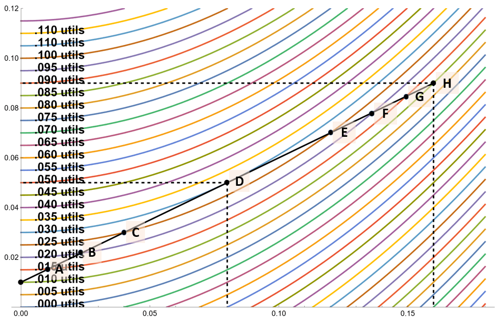
The following graphic shows a CAL and indifference curves.
For reference, the risk free rate is 1%, , and .
The indifference curves are based on the utility function from class. In this case . I’ve labeled every other IC with the utility of the points on it.
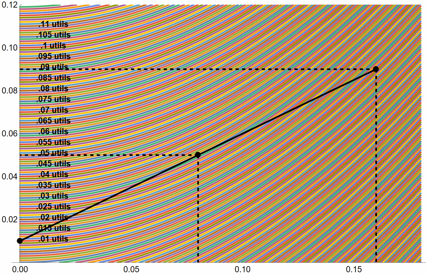
An indifference curve goes through every possible point on the diagram. For example, to the right is the same diagram with many many more indifference curves plotted. I find that a bit cluttered, so we’ll stick with the one below. →
There are actually indifference curves going through every possible portfolio. Therefore, it would really look more like this:
✏️ How much utility does the investor get at points A, B, C, D, E, F, and G? Does the investor maximize their utility at a point of tangency between the ICs and the CAL?
✔ Click here to view answer
| Point | Utility |
|---|---|
| A | .015 utils |
| B | .020 utils |
| C | .025 utils |
| D | .030 utils |
| E | .025 utils |
| F | .020 utils |
| G | .015 utils |
| H | .010 utils |
D is the only point where an IC is tangent to the CAL. It is also the point with the highest utility.
If you look at the diagram with more ICs, above and to the right↗, you can verify that the blue IC representing .03 utils is the highest-utility indifference curve that the investor can get onto while staying on the CAL (which represents the available final portfolios).
Therefore, yes, the investor maximizes utility at the point of tangency.
Risk Averse investor vs Risk Tolerant investor
In the following diagrams, I have plotted indifference curves based on the utility function from class.
The CAL is identical in both diagrams. The risk free rate is , , and . It is only that the ICs are steeper on the right.
You can see that the investor with the higher value of prefers fewer risky assets and more of the risk-free asset. This is one of many reasons why we consider to represent risk aversion.
| This relatively risk tolerant investor maximizes their utility with y=100% of their assets in the risky portfolio. . In other words, the point of tangency is just at the top end of the CAL.  | This extremely risk averse investor maximizes their utility most of their wealth in T-bills In other words, the point of tangency is low on the CAL. 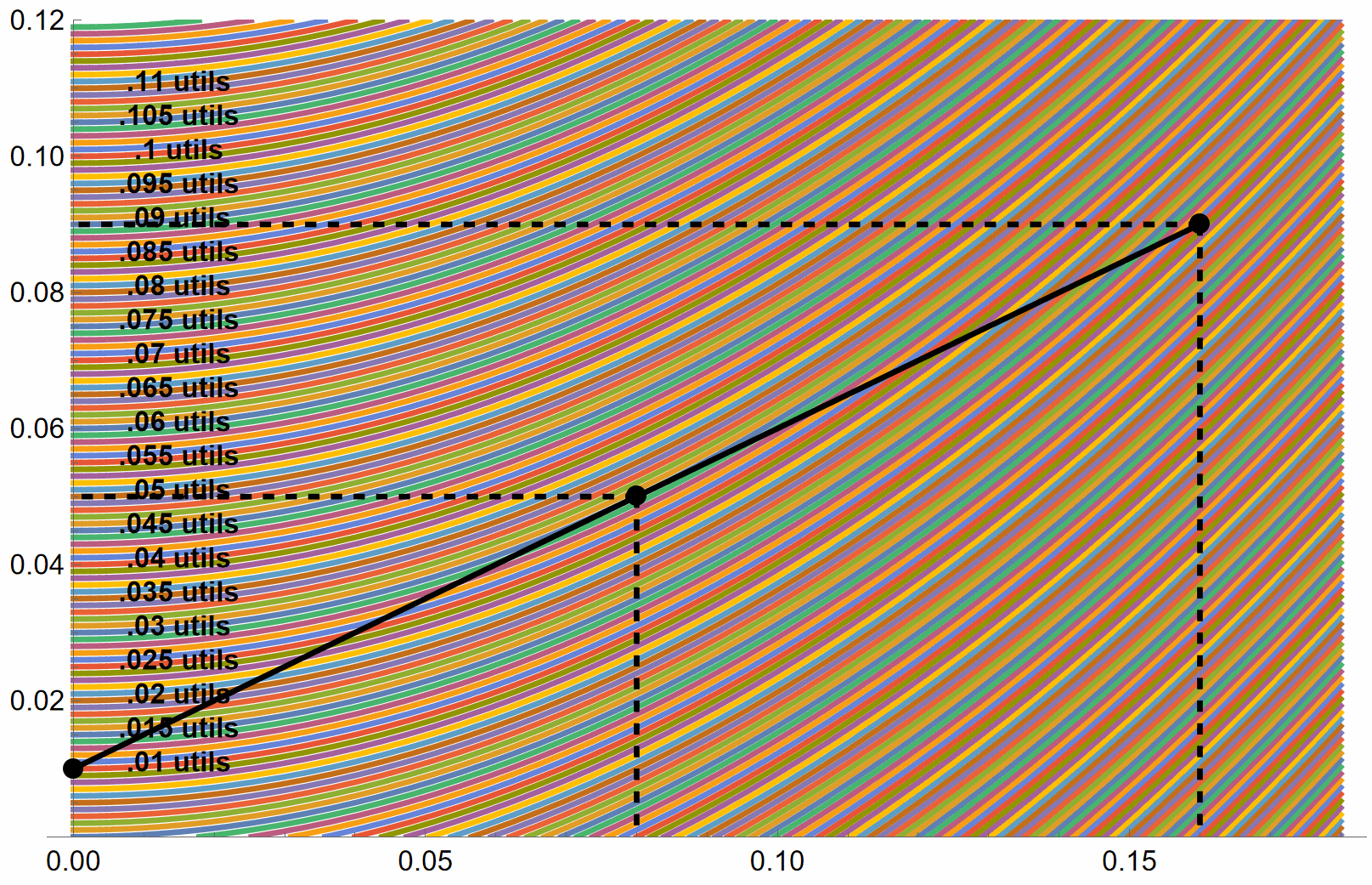 |
As we can see above, the more risk averse investor has steeper indifference curves. This is because risk averse investors require more expected return in order to be compensated for risk.
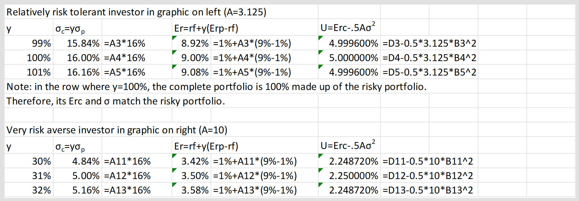
✏️ Exercise: Check my work here. I claim to have found optimal levels of for each investor, but am I right? You can verify that I’ve found the optimum by calculating and for my claimed optimum and for nearby levels of . Does my level of yield the highest utility?
For the first investor, fill out the following table to confirm that utility is maximized at . Their risk aversion parameter is .
| 99% | |||
| 100% | |||
| 101% |
Create a similar table for the second investor. Their risk aversion parameter is .

🙋 Will you please review slides 38-42 from slide deck 8 (13 Nov)? What concept is Bruce illustrating with these slides?
See answer
✔ Sure. Here are the slides you are referring to.
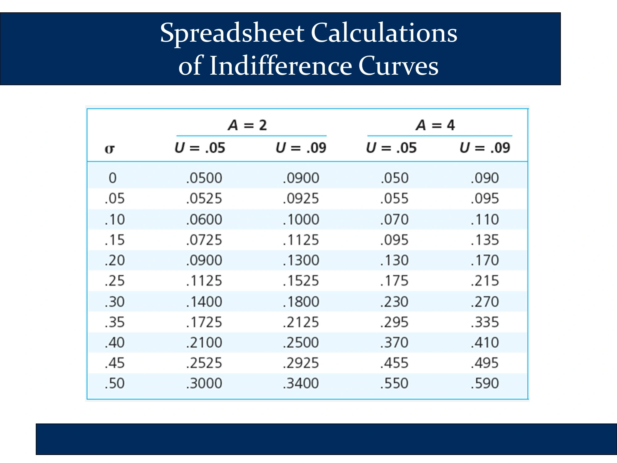
The following slide illustrates how , , and depend on . It is the exact same calculation that we did in the spreadsheet immediately above.
Columns 2 and 3 use the following formulas:
Summary: The 4 Key Modern Portfolio Theory Equations
| Expected Value of Return | Standard Deviation of Return (Risk) | |
|---|---|---|
| Capital Allocation Line (One asset risk-free) | ① | ② |
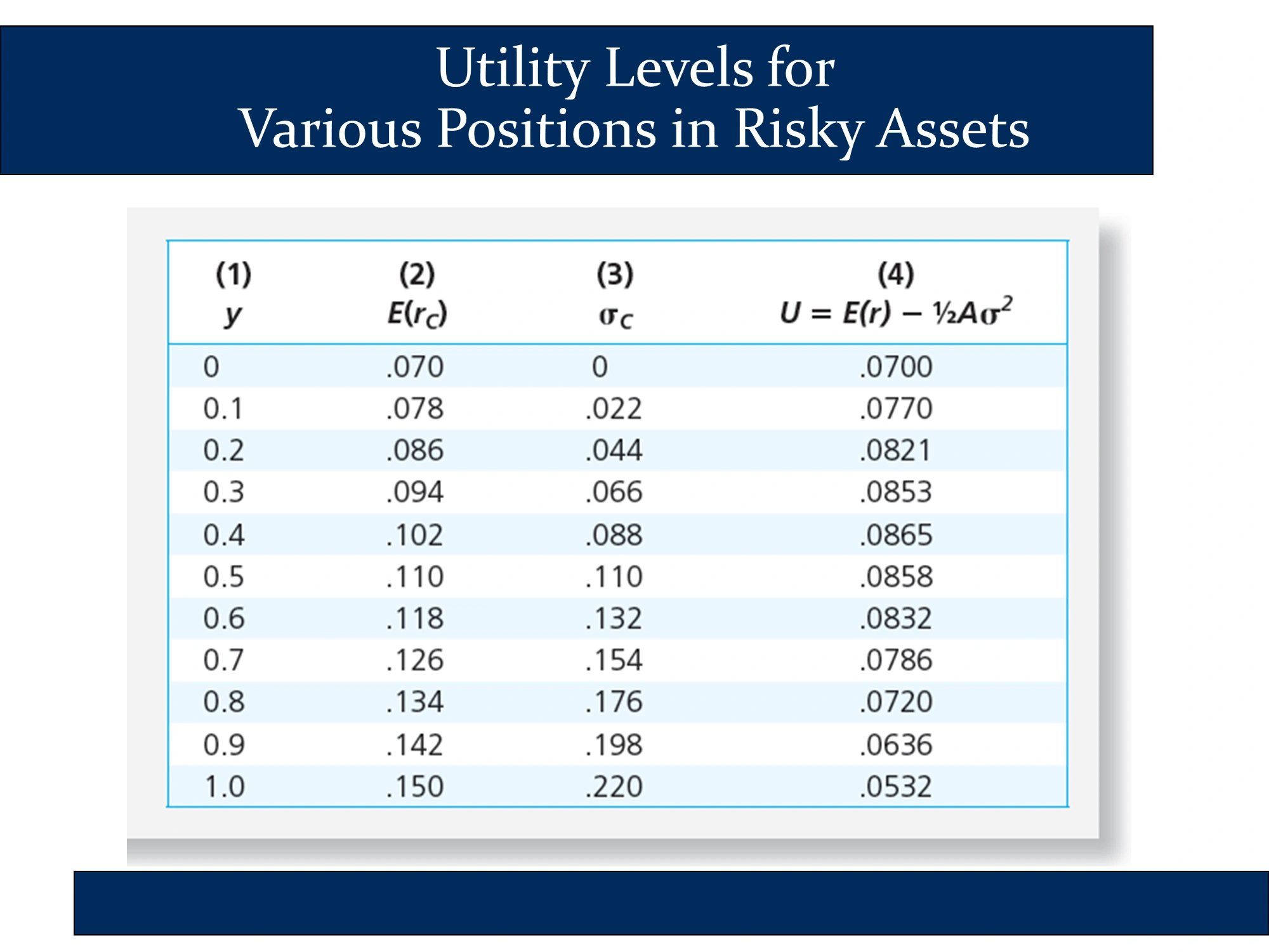
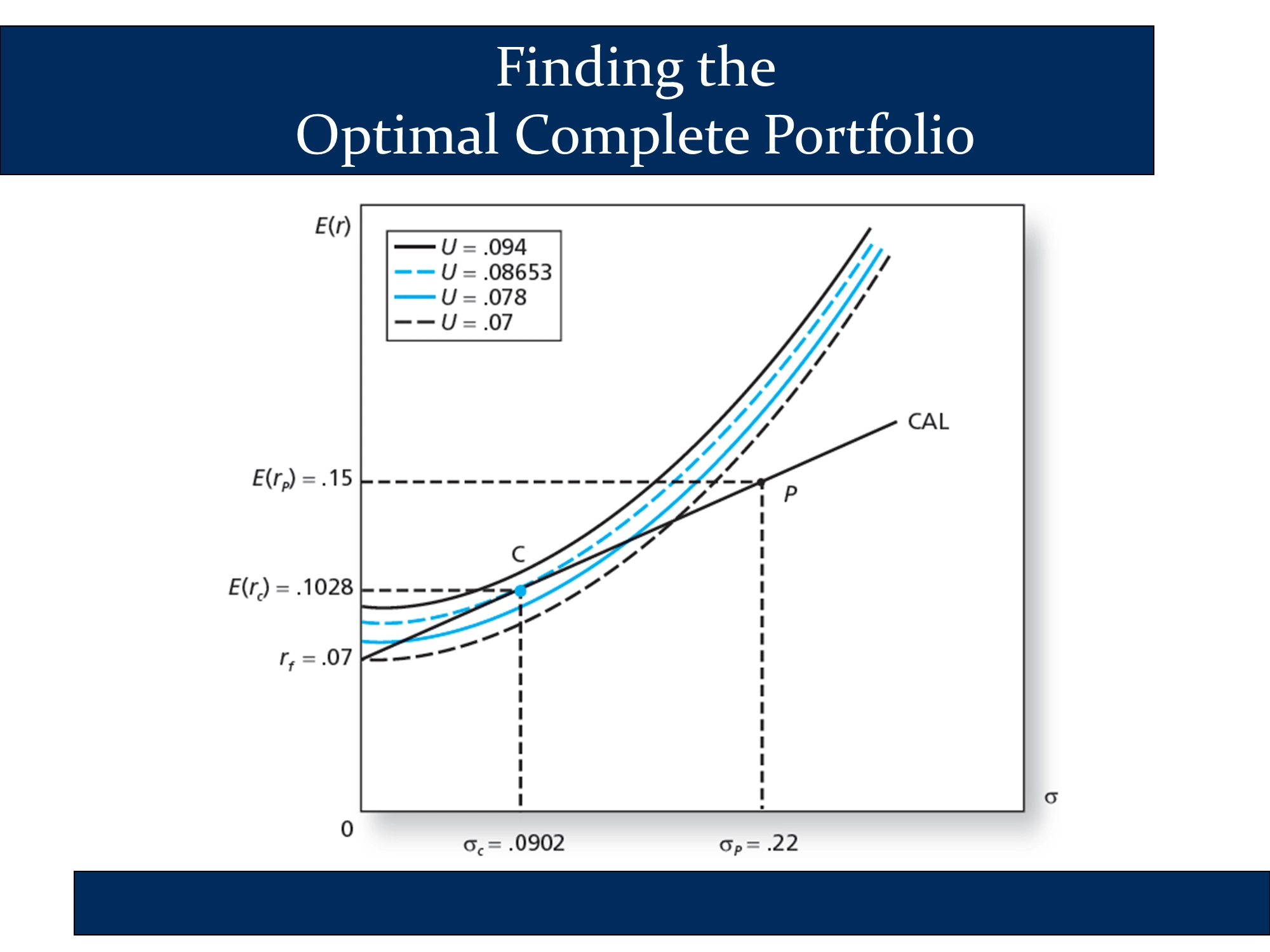
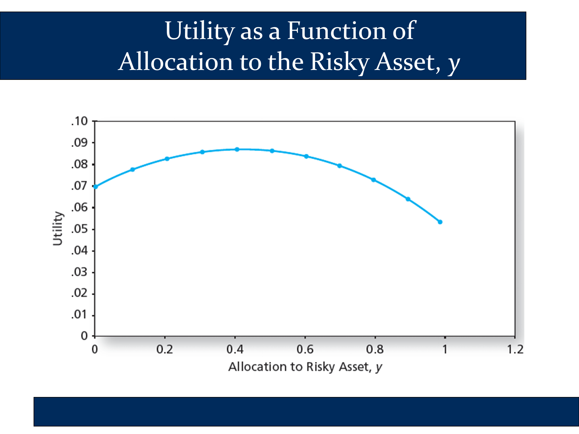
The following is a graph of the first and fourth columns of the previous slide. As you change , the investor moves along the CAL. For example, when , the investor is at the bottom of the CAL, earning the risk-free rate and facing no risk. As approaches 1, the investor approaches the other end of the CAL. The following slide illustrates what happens to the investor’s utility as increases. The fact that it has a peak around 0.4 indicates that the optimal complete portfolio of this investor involves a 40% allocation to risk assets. Overall, the fact that it has a peak indicates that for each investor there is an optimal complete portfolio that we can identify through utility analysis.
The next slide illustrates how to calculate two indifference curves for two different investors. I wouldn’t worry about this slide, but I’ve illustrated the technique in my modern portfolio theory spreadsheet in the indifference curves sheet: https://robmunger.com/1920mpt
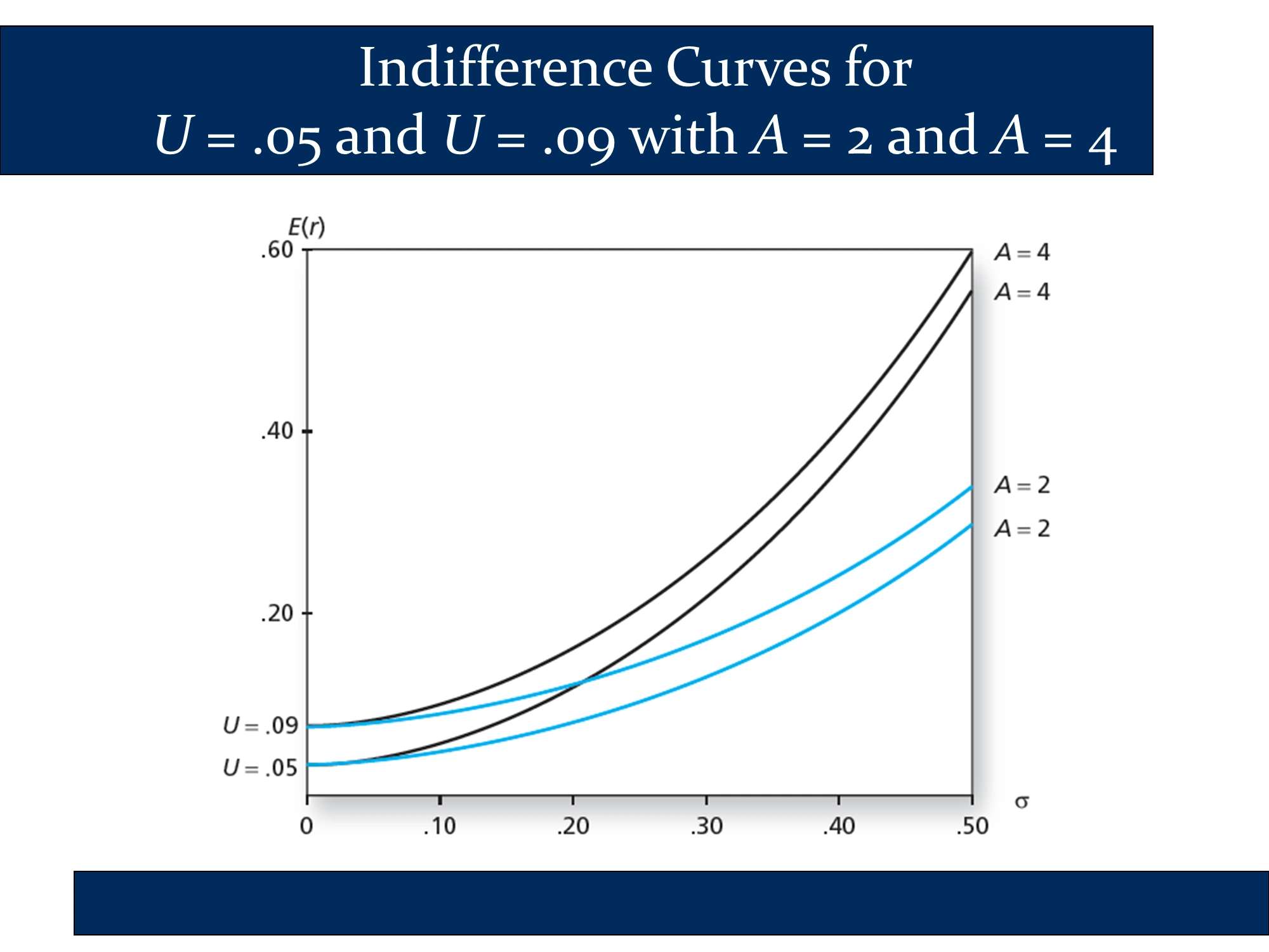
The following slide graphs the data in the previous slide. It parallels the two side-by-side diagrams that I made above (under the heading, “Risk Averse investor vs Risk Tolerant investor”) of a risk-tolerant investor and a very risk-adverse investor . In both cases, you can see how a higher value of leads to steeper indifference curves. My diagrams also illustrate how the steeper indifference curves lead to a tangency point (i.e., a optimal complete portfolio) that is at a lower point on the CAL.
This slide illustrates the same point that I make in the top graph on this page. Namely, it illustrates that investor will be on the highest utility curve, thereby maximizing their utility, at the exact point of tangency between the CAL and an indifference curve.